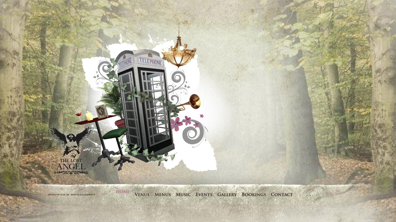
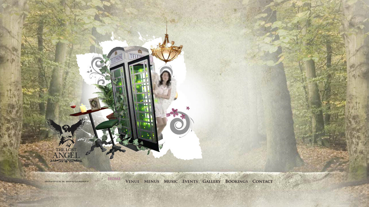
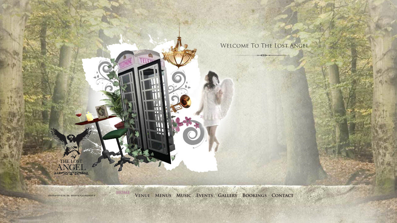
Lost Angel: Flash microsite
Immersive Flash micro-site for one of London's leading destination bars
Overview
In the summer of 2008 I was fortunate-enough to meet the very talented James Piper, whose work I had admired for some time.
James and I knew pretty quickly that we wanted to work on a site together, and it wasn't long before a new bar venture, The Lost Angel in Battersea approached James to produce a website that would be as magical as the new destination boozer they intended to create.
Creative
James was instrumental in helping the bar define their brand, but we wanted to take the interaction to another level.
We decided that a Flash-based site, with music, animation and a narrative would be the answer. Even though a large download seemed counter-intuitive, just as the world was speeding up, we wanted a destination website that would delight as much as the destination bar.
James and I worked closely together, with James designing beautiful 2D layouts with an animation-focused, transitional feel, from section to section. I worked hard on both the 3D modelling, compositing and After Effects animation, with James providing live action, art-direction, layout, assets and audio.
Our approach was iterative, working with a clear design ethos mind, across layout, design and animation, in Photoshop, 3dsmax, After Effects and Flash, ultimately bringing everything together in a slick Flash Microsite.
Implementation
After building all the animated assets, the site was built as separate SWF modules that loaded into a single container that contained the logic, graphics, and common assets.
About a year after the project I found out about the Gaia Framework which in hindsight I wish I'd used as it would have shaved a big chunk of time and a lot of bug finding off the project (as it happens I used Gaia for various other projects in the following years).
The site itself contained audio, video, Away 3D, 3dsmax and After Effects animation, a small amount of back end, but mainly a lot of attention to detail within the Flash and the animation to make the user feel as if they were part of a magical experience even before getting to the bar.
Making-of
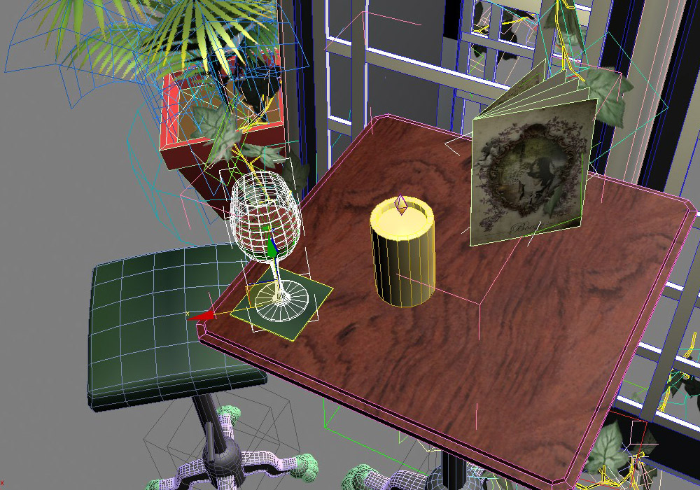
Here's a selection of screen shots from the asset-creation segment of the job, that ultimately ended up in both the pre-rendered animation sequences, as well as the live Away 3D animation.
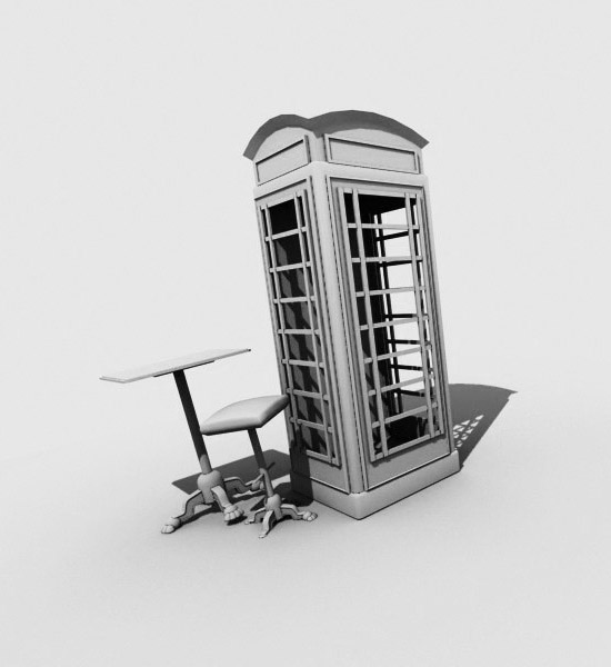
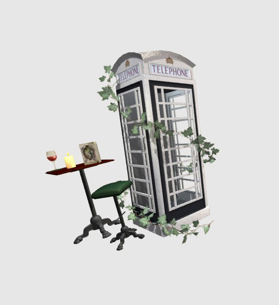
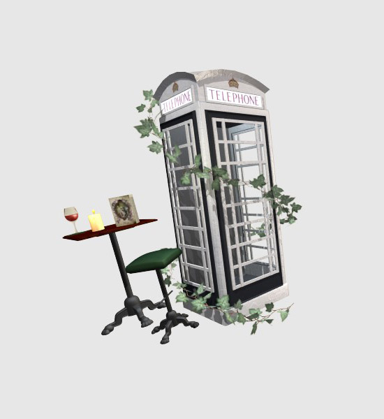
Telephone box
The bar had a real telephone box at one end, painted white, in which you could go to make phone calls (on your mobile of course!). Here are some early lighting tests:
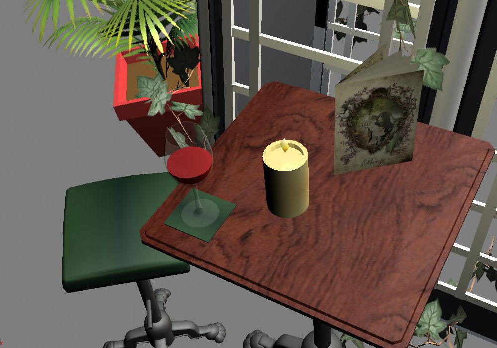
Bar table
Next to the telephone box in the site, is a bar table and couple of stools. These animated on during the site intro, with the wine slipping and slopping in the glass, and the candle flickering into light:
Picture frame
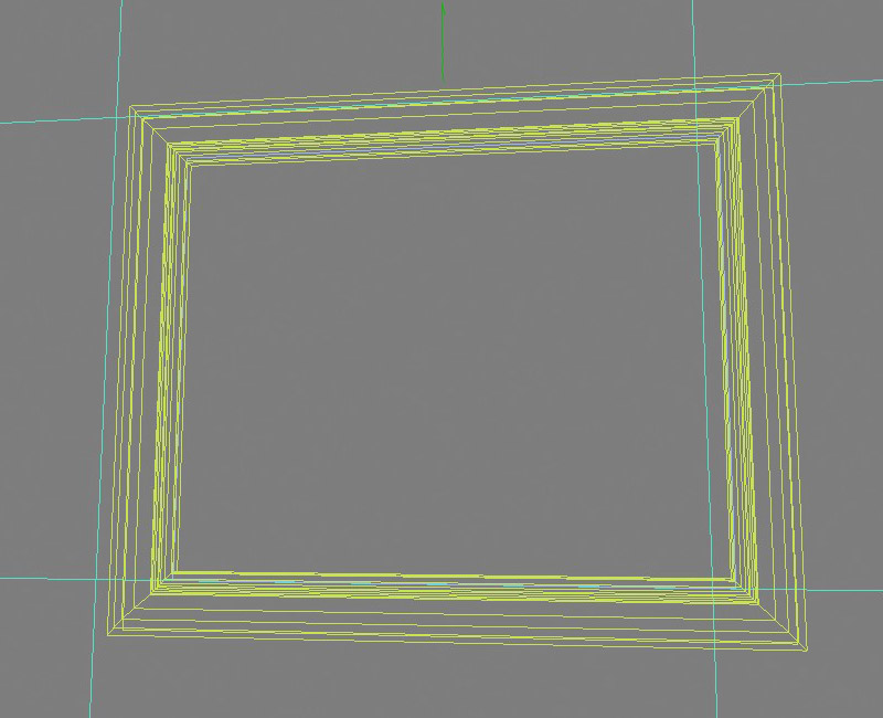
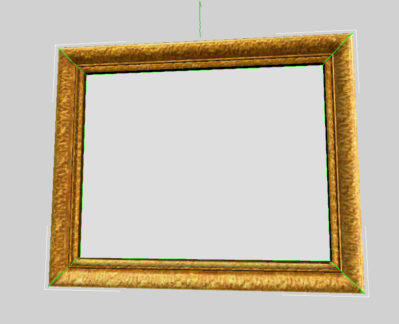
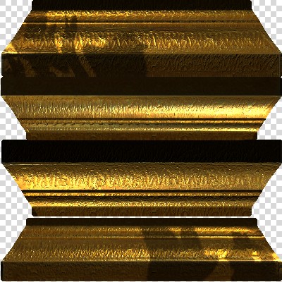
The gallery section of the site used Away 3D to create a 3D wall and transition smoothly between different galleries, which were each displayed in 3D picture frames:
Ivy
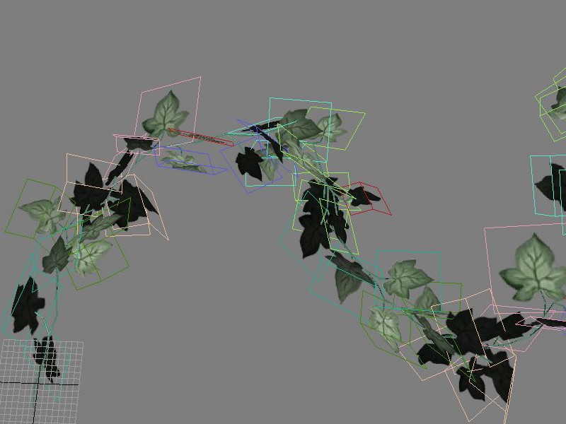
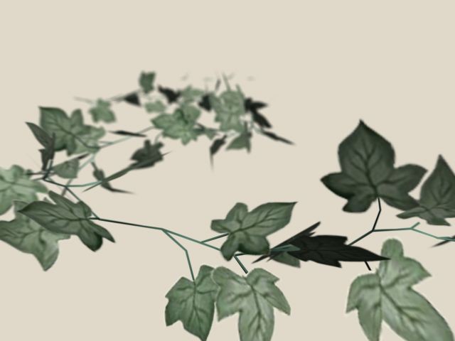
Ivy was used throughout the bar, and we used it in the same decorative way in the site, in both 2D and 3D space:
Ivy loader
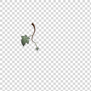
Because the site was a larger load than your usual site, thanks to the video and 3D textures, I created an "Ivy Loader" for something nice to look at as the modules loaded in:
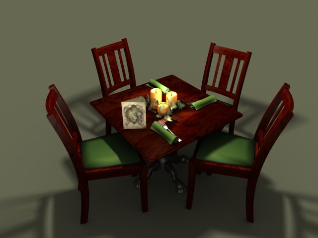
Dining table
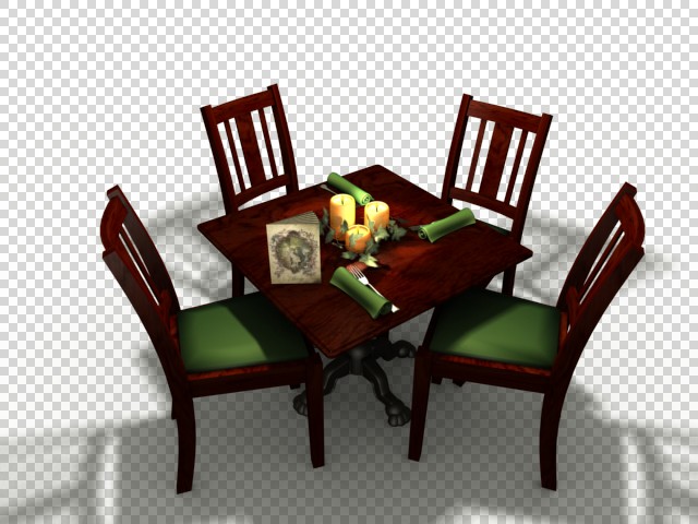
The menu section of the site featured a formal, dressed dining table with animated place settings:
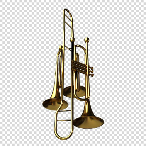
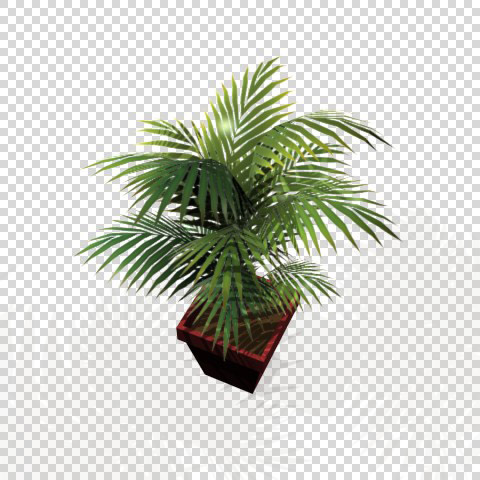
Random items
We needed to model a variety of items which were found in the bar to give the site an opulent, decorative feel:
