F1: Global Broadcast Report
SPA for data-driven end-of-year report for Formula One


Overview
I've been working with Formula One Management for the last 5 years, building the interactive Global Broadcast Report to share the previous season's results with major stakeholders such as team bosses and TV execs.
In previous years the approach has been to publish the report as a semi-interactive Flash presentation distributed on CD, however this year we decided to move to cross-device HTML, with fully-live data, published on the web.
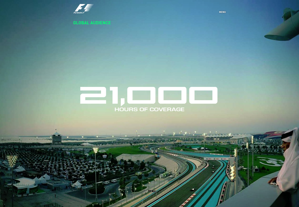
The major change from previous years was making all content live, rather than just presenting static images. This involved a lot of thought and planning, which actually ended up being quite difficult in the short time-scale we had to complete the project at the end of the season, especially as data, design and implementation were all progressing at different rates.
Implementation
Across 5 major sections and 12 subsections, I employed:
- Parallax and smooth scrolling, locking to sections as the page scrolls
- Fully touch-enabled UI
- Data-driven graphics from external sources
- Interactive SVG maps
- Interactive Google charts
- Full-screen images, loaded according to maximum screen dimensions
- Cross-platform video pop-overs
- A pixel-perfect design implementation
- Custom VBA programming and data-migration
There's no doubt it was a much, much bigger job than the previous year, but the results were worth it.
A lot of the work involved wrangling data. Not only was there all dynamic data such as Audience Demographics and Market Analysis, but there was a lot of editorial information that all needed to come together in a single, unified presentation.
For the dynamic data I created and curated a set of master spreadsheets FOM would use to compile the data, from which I wrote an automated tool, Excel Data Exporter, to export this to usable web formats. For the editorial data, unfortunately the best trade-off was to copy and paste this directly into the HTML document itself.
Probably the biggest challenge was working with the designer to implement the highly-detailed design and the level of customisation between the sections, charts, and visualisations. Nearly no two elements were the same, so a base HTML layout handled the markup, whilst a robust JavaScript framework was built to handle all disparate functionality, as well as providing a common base for what could be factored out.
Next year
Next year will entail reflecting on the challenges raised this year, and implementing the new data set. As the design is so bespoke, we plan only to change the content and not the layout. Luckily the footage and imagery we get from F1 is incredible, so we've built something hopefully quite future-proof for a good few years.
Links
If you're a recruiter or agency and you'd like to see this project live, drop me an email.