YouTube: Map My Summer
Flash micro-site with heavy use of mapping and video APIs
Overview
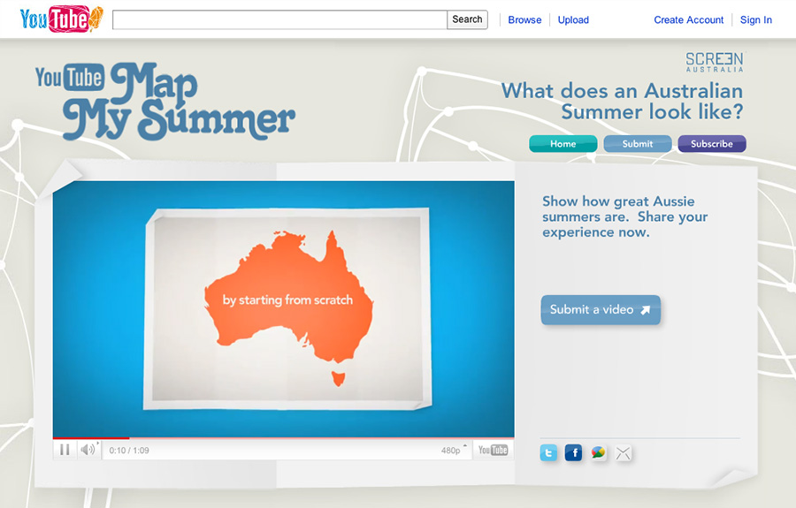
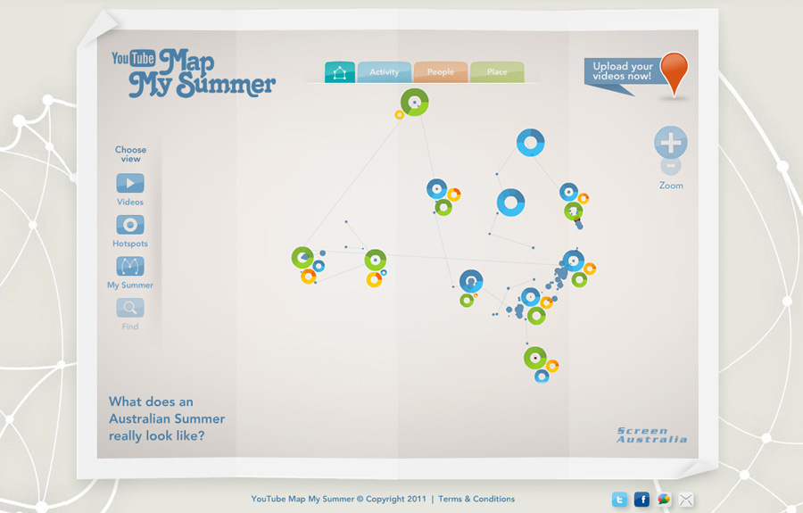
To find out what an Australian summer actually looked like, YouTube Australia invited the nation to remap Australia, using just their summer experiences. Every upload was geo-located using Google Maps technology to create the world’s first summer map. By the end of the campaign, YouTube Map My Summer had become a lasting visual archive of our summer in 2010-11, good and bad, for the whole world to see.
Premable
I worked with Rehab Studio (UK) and The Monkeys (Australia) as the lead Flash developer on the project. The design brief was extremely tight, with the live data bringing the already-stunning visuals to life, and the overall concept and uploaded content providing a richness of interaction I've not experienced in any project prior or since.
Implementation
The project evolved over several distinct areas:
- Working extensively with the Google Maps API, and building a powerful mapping component that would provide the base for displaying and interacting with the vast amount of geo-tagged and uploaded data.
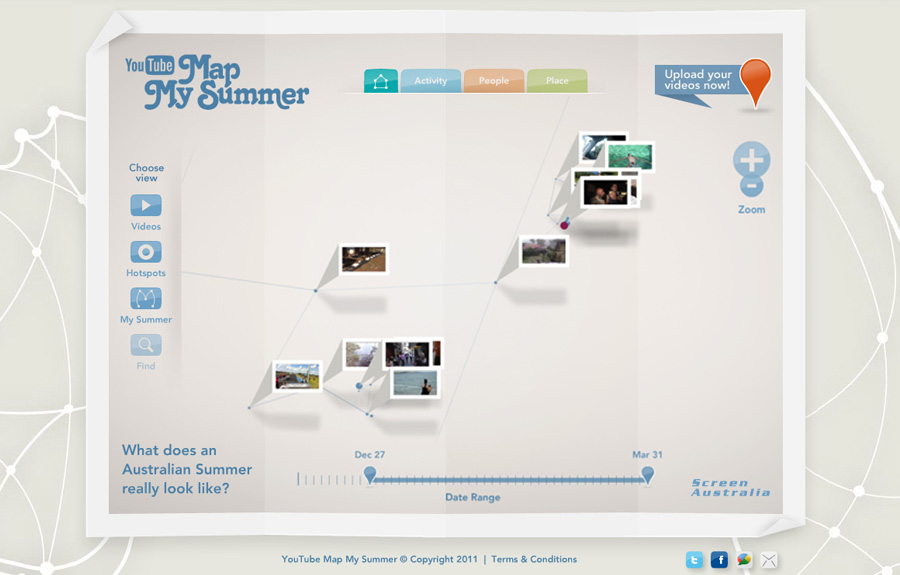
- Data-management and marshalling, where a filtered and aggregated subset of points would be loaded and combined with a level-of-detail algorithm to allow the user to visually zoom-in and out of the dataset without it ever becoming too crowded. In the end, data could be filtered physically, temporally, and by various other taxonomies to boot. I worked extensively with the back-end team, providing prototypes, proof-of-concepts, and other experimental code to work out the best approaches to making this part of the project sing.
- The YouTube API integration, both on the server-side and client-side, such as browsing, choosing, and playing the uploaded video content.
- The layout and UI of the application - many, many separate design elements, components, and sub-applications, all working together to create a cohesive and satisfying user experience.
Challenges
The main challenge in this job was just the sheer scale of it.
Areas covered included big data, mapping, video, an overall extremely high-level of interaction, rich media components, trigonometry, 3rd-party APIs, Flex, Flash, back-end integration, experimental coding, forms, layout, design, animation, not to mention working with folks from the other side of the world at times you'd rather have been tucked up in bed!
Even just one of the components by itself would feel like a normal job, and this was before the demands of the campaign were considered, along with the very high expectations of the design agency and ultimate client, which ultimately were to contribute significantly to the site's success and numerous awards.
The job itself was fantastic fun for a developer to work on, and although the deadlines and workload were absolutely horrendous at the time, the range of technologies, skills and experiences that needed to be brought to bear in order to achieve the project goals, made this one of my all-time favourite projects to have been involved in.
Videos
App promo:
Campaign promo:
Awards
- FWA: Site of the Day 21st April 2011
- One Show: Interactive Merit
- The Work: 2011 Annual


