


Branding Experiment
Branding experiment with overlays and colour mapping


Overview
Although I spend the majority of my time writing code, I love to jump into PhotoShop, Sketch, recently Figma, and this time After Effects.
Whilst investigating branding options for Control Space I came across the idea of overlaying rectangles, which seemed like it might be a clever nod to the fact that all my work (animation and web development) is effectively screen-based.
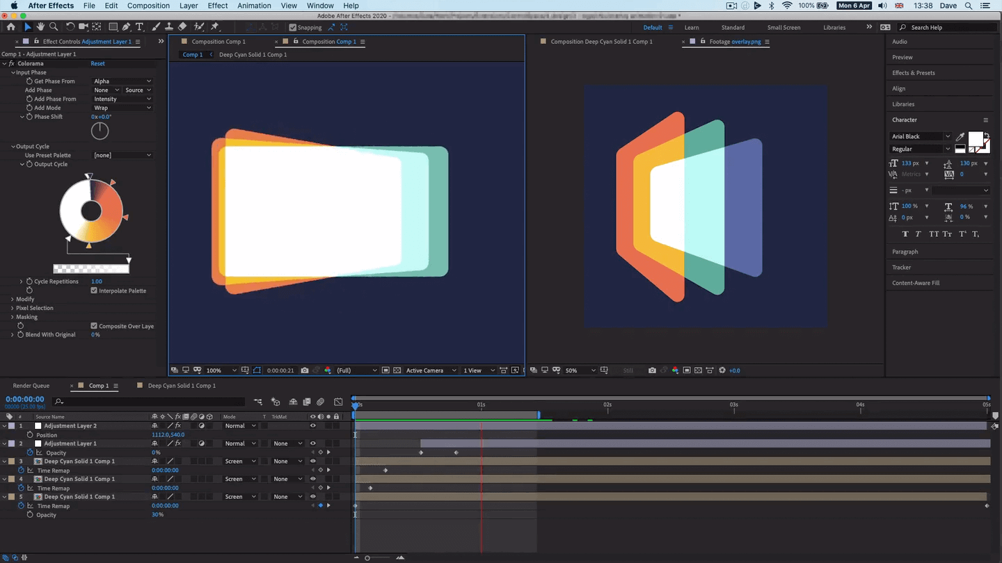
Implementation
Coming up with a quick overlapping rectangle design in Sketch, opacity and blend modes were used to generate distinct greyscale values for the overlaps.
Next, the image was taken into Photoshop and the colours eye-dropped from reference palettes, then tweaked and adjusted manually.
Finally, once colours were decided, completely new overlapping rectangles were created in After Effects, positioned in 3D space with a camera, and the final composite was coloured using the Colorama effect.
This transforms lightness values to specific colours to give the final effect:
Animation
I really didn't spend any time on the animation – as I haven't used After Effects in a long time – this was just to check that the colour mapping setup worked:
Here's one with text:
Thoughts
As you can see from this site and the Control Space site, the idea didn't go further than a few experiments, but certainly something I enjoyed, and worth a share!