FairSquare
Greenfield build of car finance and sales platform
Overview
FairSquare is an online-only car financing and sales platform.
It allows people of any credit rating to buy a car on credit, using live credit rating algorithms to tailor the best offer for the individual, from a range of lenders, and provide the cars to be sold from a catalogue of nationwide UK dealerships.
I lead a small team to work directly with the stakeholders and build-out a greenfield platform. The project lasted about 9 months, and we covered every aspect of a large site build, from front end to backend, from UX flows to database optimisation, from component libraries to Worldpay integration, from SEO to regulatory requirements.
Detail
Business requirements
FairSquare is a big, complex proposition, with a number of years' work before it got to us.
We were tasked with both understanding the current business and larger vision, as well as taking a small proof of concept based around auctions and live bidding, and extrapolating and building on that to create a much larger site.
There would ultimately be various ways for a customer to browse and purchase a vehicle; either brand new or previously-owned, requiring the team to wrap their understand the mechanics behind various car finance credit models such as PCP and HP so we could clearly guide customers to well-informed purchase decisions.
Working practices
We worked as a small in-house design and development team at Gravity Global with weekly meetings with stakeholders where we presented progress, received feedback, and ideated on subsequent work.
We also worked closely with an off-shore team who were developing (one of) the back end(s).
Later in the project our small team merged with the client's strategic and technical leads in an off-site location (a lovely We Work, thank you!) to collaborate more closely and deliver the final phases of the project, expanding with additional freelancer resource to deliver to demanding go-live deadlines.
UX
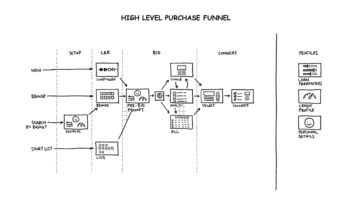
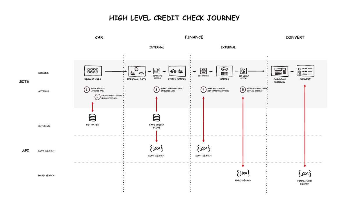
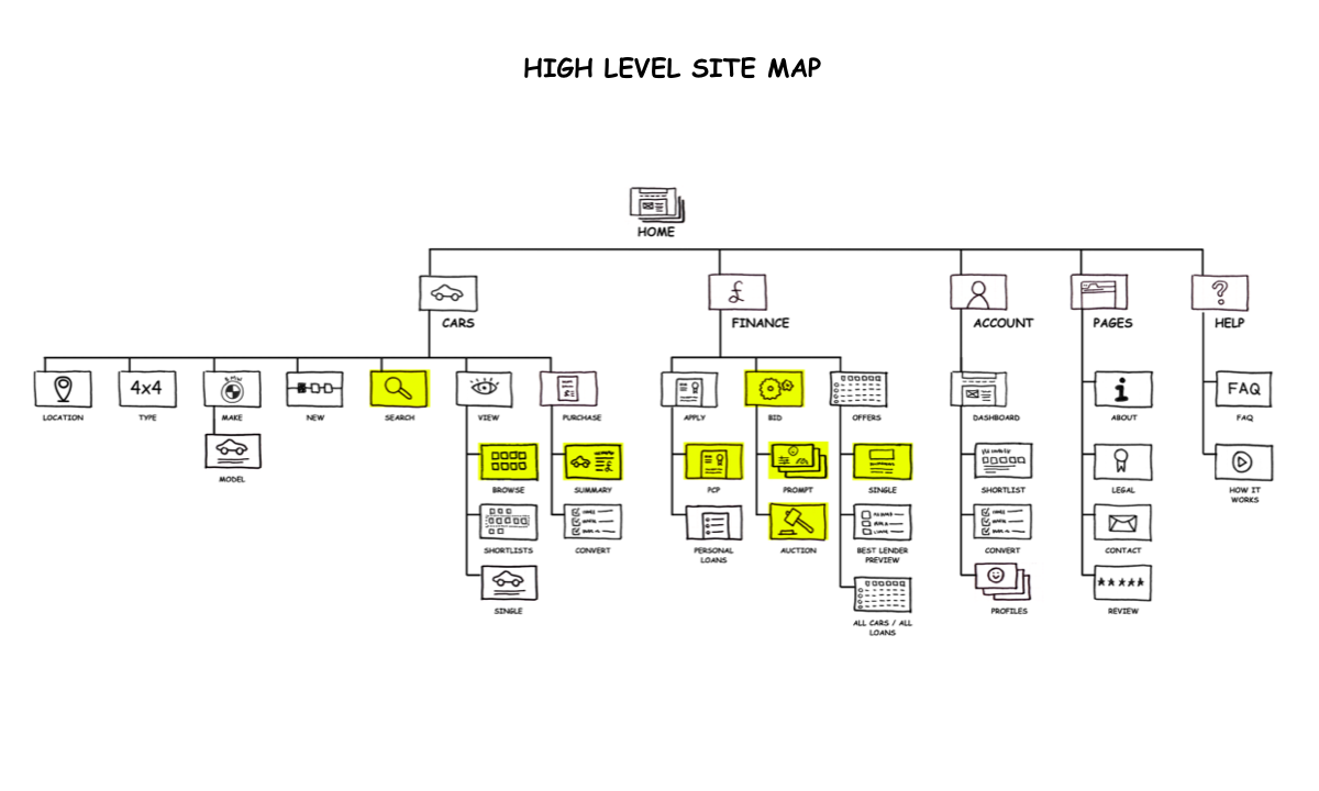
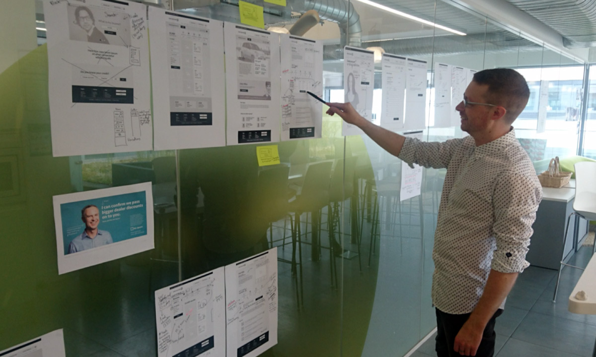
This project was lead by core user journeys, and we began by planning and prototyping low-fi UX flows in collaboration with stakeholders to ensure we understood their requirements and were going in the right direction:
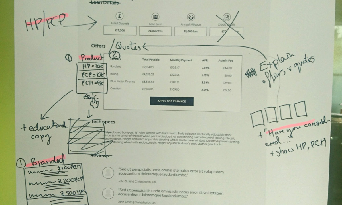
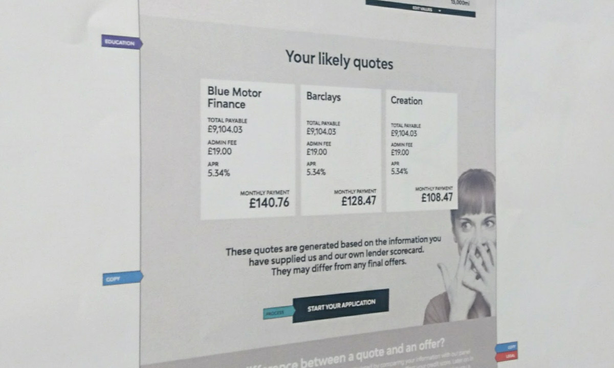
Having understood the brief, we iterated on increasingly accurate fidelity of wireframes to realise user journeys on paper, before building any significant parts of the site:
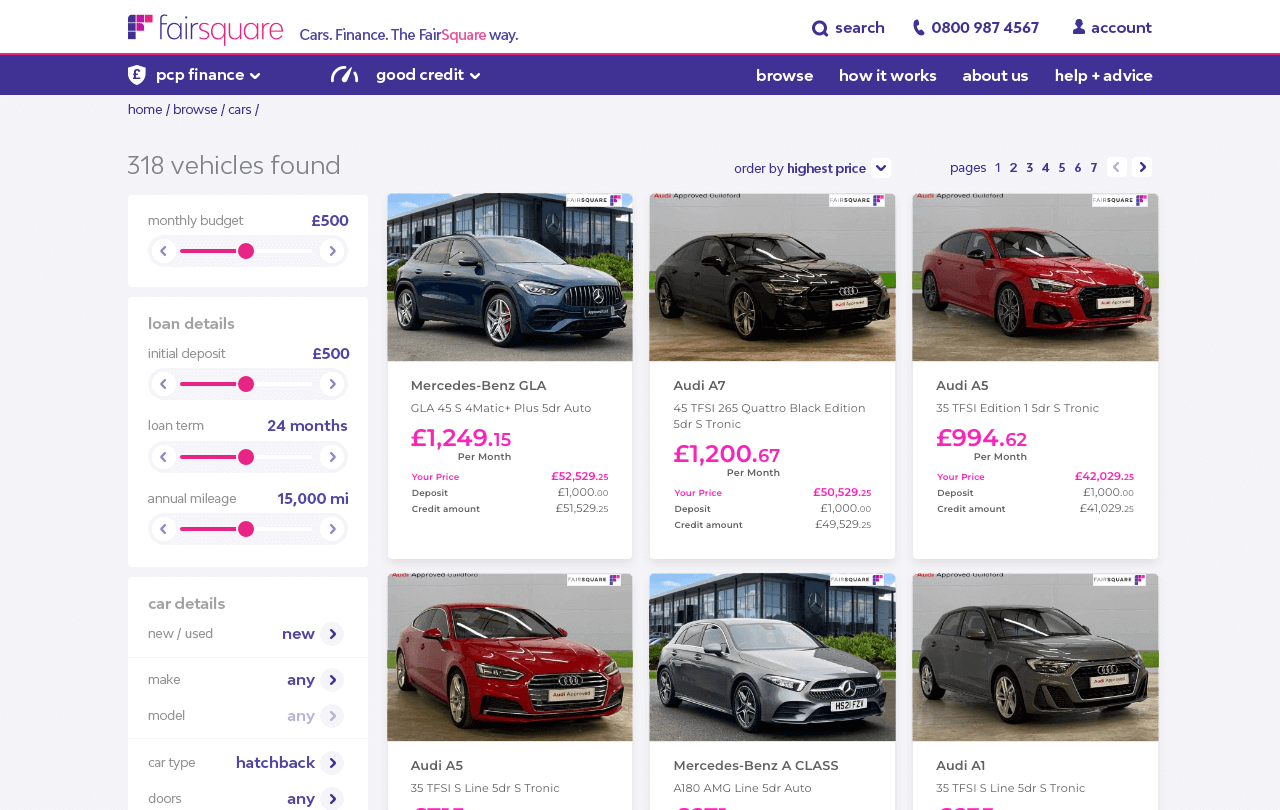
There were multiple, complex sections and flows to be researched, planned, designed and built; from the browsing and financial journeys (integrating with multiple 3rd parties) to the credit checking, user account, purchase, and delivery journeys.
Because the client was effectively a start-up, this collaborative process helped them to understand their own ideas as we reviewed new mockups and designs together.
Technical
The technical side of the project ran in tandem with the UX and design, almost from the start.
Being a nine-month project, there were myriad technical challenges to surmount, including but not limited to:
- understanding and refactoring the original POC supplied by the client
- architecting the overall frontend build
- state management challenges around complex search requirements
- a huge amount of forms and form validation
- building and maintaining an ever-expanding component library
- integration with the backend and 3rd-party financial services
- customer account, checkout, delivery and Worldpay payment flow
- specific backend refactoring and database optimisation tasks
- additional regulatory requirements around handling sensitive credit data
- and the list goes on, and on, and on...
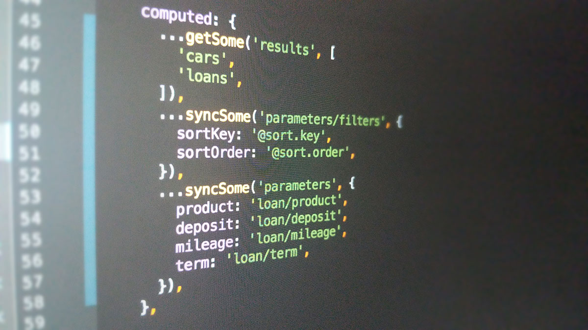
The application itself is a Vue 2 and Vuex build, with Semantic UI as the UI framework. Had Nuxt been an option (it wasn't even in alpha when we started) we would have gone down that route.
Interestingly the project's heavy use of Vuex lead to the development of a state management solution which would ultimately become Vuex Pathify:
We also used Laravel Sketchpad to set up and run local database tools and queries.
